
Hatfield, UK - Town Branding
As part of University course, we were asked to brand a small english town called Hatfield.
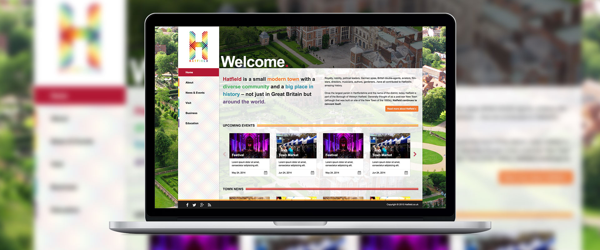
With my research on hand, I knew what are the features of Hatfield I have to work with. My goal was to change the whole perception of Hatfield and create a modern, unified, flexible, and future-focused image of the town.
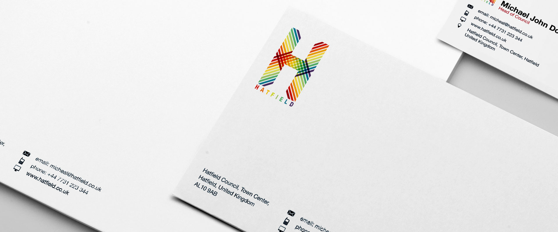
I started out with my focus on building a branding language which can be used throughout Hatfield and work as a way to modernise and colour the town.
Concept of the logo is to do with diverse community of Hatfield and how it all comes together for - or potentially will - to create a friendly and growing community. This is illustrated by the lines of different colours, depicting diverse community - meeting at a point to create a square, depicting community.
This logo takes the approach of creating a modern look for the town, in essence, this logo does not only say what Hatfield is right now but what it will be in near future as Hatfield is in process of reinventing it self.